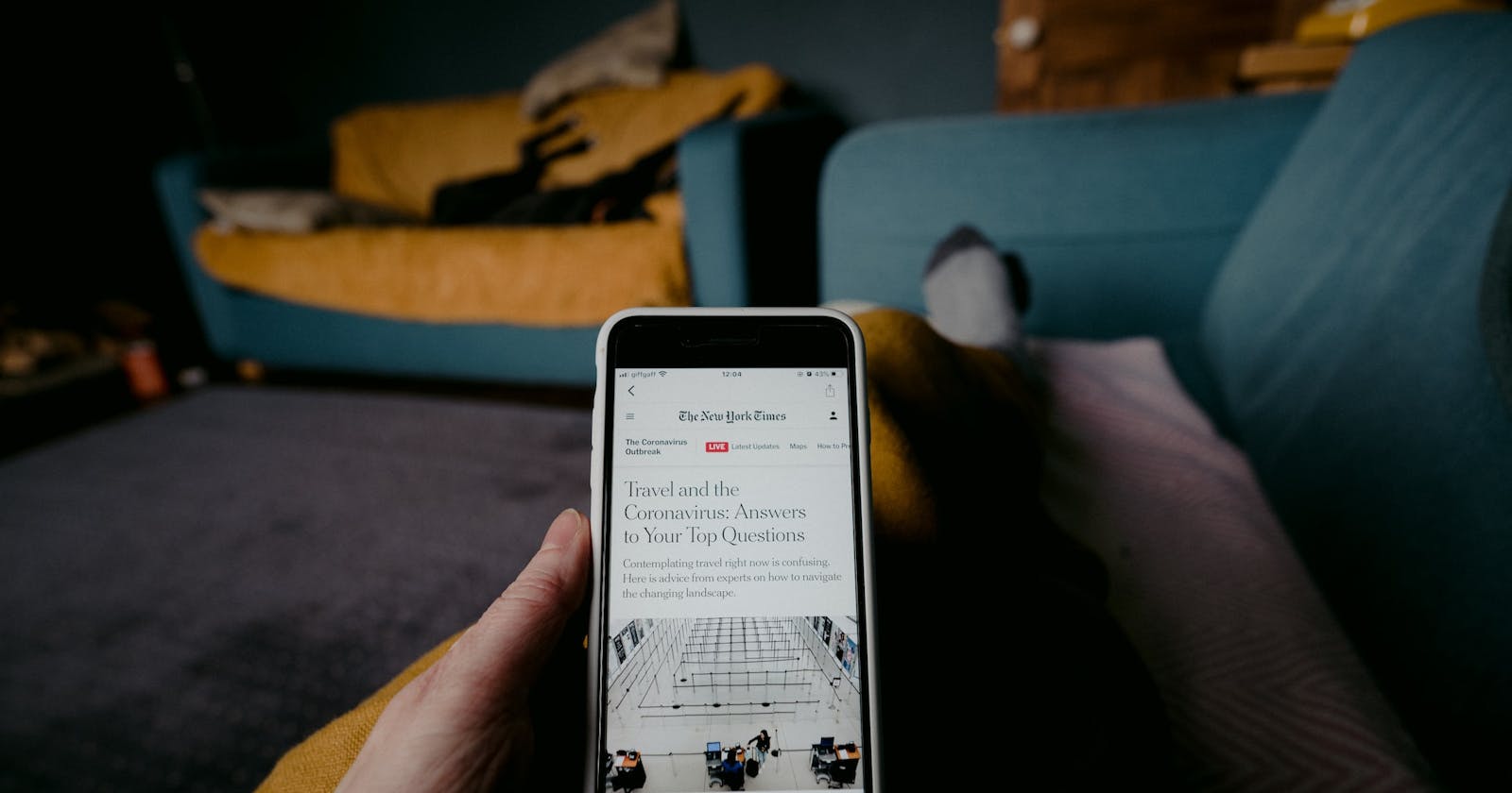
In 2018, Johny Vino, an Indian UI/UX designer, set out to reinvent the New York Times mobile app into a fresh and relevant app that ensures customer loyalty by building its users' reading habits. In four minutes or less, you'll get to see it all; from the thought process to the final prototype.
Introduction
Right off the bat, it was evident that he wanted to tailor the app to the user's preferences.
He looked to provide users with timely quick-read articles ranging from 2–5 minutes of reading time. He wanted the app to provide news catered to specific users based on their schedules and habits.

He and his team set out to obtain some key statistics on global news consumption. They got some data from Reuters and also carried out research of their own.
Data obtained from the Reuters report detailed various scopes ranging from the growth of the usage of news apps to the most popular online calendar in the market.
They also carried out research to find:
The most widely-used media for obtaining news.
What people do with their phones on pick-up.
When people use their phones.

After all this, they carried out qualitative research on potential users.
They set their target audience to be tech-savvy New Yorkers aged between 20-40 who didn't have the time to read the daily newspaper due to their busy schedules.
They went on to analyse the input from these potential users and they concluded that their app should be based on three key principles:
Seamless Integration of the app into users' daily habits
Simplicity of usage.
Politeness (in the sense that the app mustn't contain intrusive notifications and irrelevant information.)
After establishing these principles, they went into the design stage. They drew up no less than fifteen unique designs which all looked to solve the issues of the original New York Times app. They then asked people in their test groups to vote for the one they viewed to be the best — Once again putting the user first.
After they were all done with the voting process, they moved on to create a visual storyboard, illustrating how users will be able to explore the features of this app. The storyboard went under close scrutiny and tweaks were made to ensure near-perfection.
Once the storyboard had passed the test, user journeys were made and a final prototype with two modes was made.
The final prototype had two modes:
The Manual Mode; which asked users how much time they had to read so the app could tailor users' suggested news articles based on their time constraints.
The Automatic Mode; which integrates with a user's calendar and suggests news articles based on the amount of free time the user has in his schedule.
Conclusion
There you have it. That's how Johny Vino reinvented the New York Times app through user-centred deep thinking from your typical ol' news app to a brand new companion that shows you news, how you want to see it, when you want to see it.
Hope you enjoyed this article. See you later!

